视图容器组件
CoverImage覆盖在原生组件之上的图片视图。可覆盖的原生组件同cover-view,支持嵌套在cover-view里。CoverView覆盖在原生组件之上的文本视图。可覆盖的原生组件包括 map、video、canvas、camera、live-player、live-pusher 只支持嵌套 cover-view、cover-image,可在 cover-view 中使用 button。CustomWrappercustom-wrapper 自定义组件包裹器 当数据更新层级较深时,可用此组件将需要更新的区域包裹起来,这样更新层级将大大减少MatchMediamedia query 匹配检测节点。可以指定一组 media query 规则,满足时,这个节点才会被展示。 通过这个节点可以实现“页面宽高在某个范围时才展示某个区域”这样的效果。MovableAreamovable-view 的可移动区域MovebleView可移动的视图容器,在页面中可以拖拽滑动。movable-view 必须在 movable-area 组件中,并且必须是直接子节点,否则不能移动。NativeSlot编译的原生组件支持使用 slot 插槽PageContainer页面容器RootPortalroot-portal 使整个子树从页面中脱离出来,类似于在 CSS 中使用 fixed position 的效果。主要用于制作弹窗、弹出层等。ScrollView可滚动视图区域。使用竖向滚动时,需要给scroll-view一个固定高度,通过 WXSS 设置 height。组件属性的长度单位默认为 pxSlotslot 插槽Swiper滑块视图容器。其中只可放置 swiper-item 组件,否则会导致未定义的行为。SwiperItem仅可放置在 swiper 组件中,宽高自动设置为100%View视图容器
<template>
<view class="viewContainer">
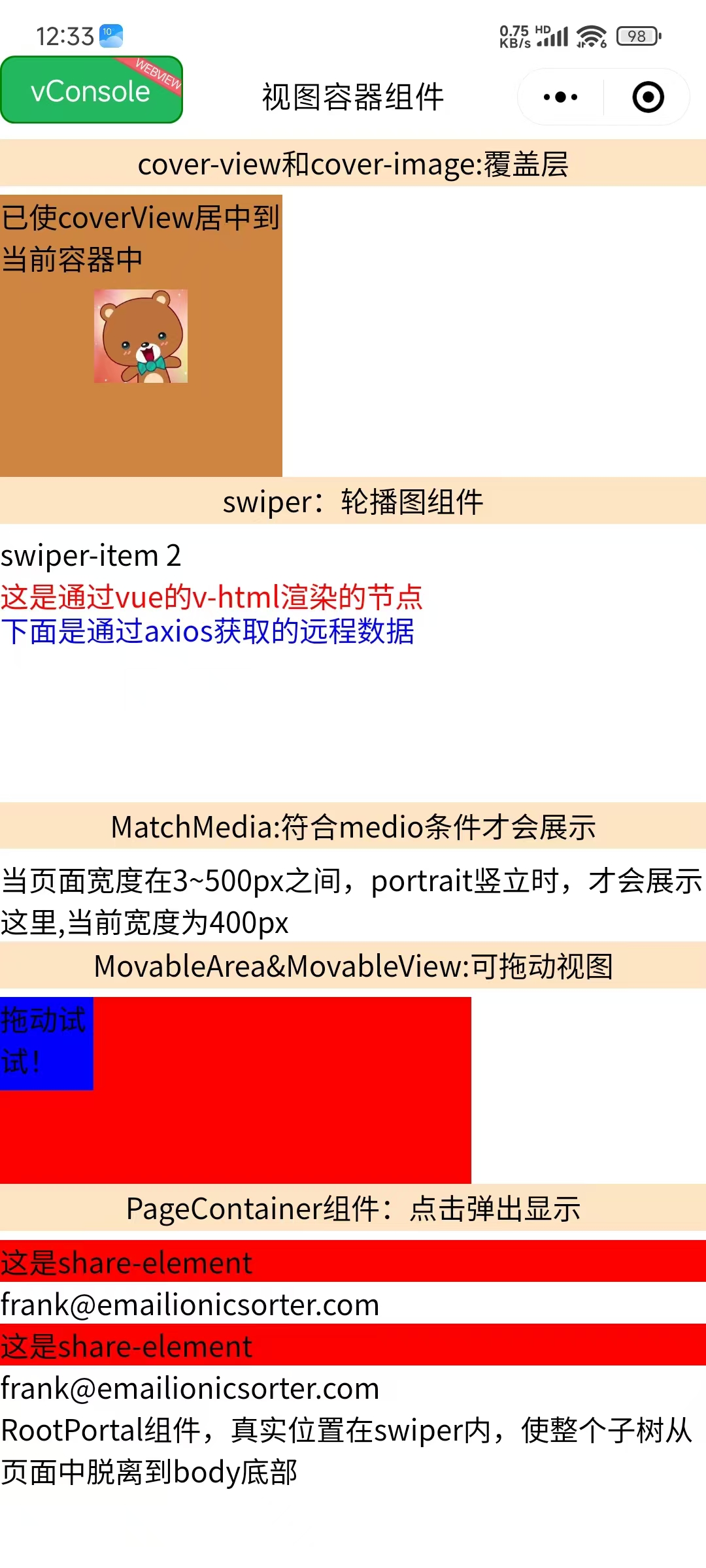
<view class="title">cover-view和cover-image:覆盖层</view>
<cover-view
:scrollY="true"
:scrollWithAnimation="true"
:scrollAnimationDuration="3000"
@tap="play">
<cover-image
fixedTop="0"
fixedLeft="20"
src="@/assets/img/1.jpg"
@tap="onImageTap" />
</cover-view>
<view class="title">swiper:轮播图组件</view>
<swiper
:autoplay="true"
:interval="3000"
indicator-color="red"
indicatorActiveColor="blue"
adjustHeight="highest"
vertical
circular
indicatorDots
@tap="handleTap">
<swiper-item>
<view>下面是RootPortal组件:穿越到root底部</view>
<root-portal :enable="true">
RootPortal组件,真实位置在swiper内,使整个子树从页面中脱离到body底部
</root-portal>
</swiper-item>
<swiper-item>
<view v-html="html"></view>
<view class="text" v-for="item in list.value" :key="item.bar">
<text>通过axios获取的远程数据:星级:{{ item.bar }}星</text>
</view>
</swiper-item>
</swiper>
<match-media
orientation="portrait"
style="width: 400px"
min-width="3"
max-width="500">
MatchMedia:符合media条件才会展示.当页面宽度在3~500px之间,portrait竖立时,才会展示这里,当前宽度为400px
</match-media>
<view class="title">MovableArea&MovableView:可拖动视图</view>
<movable-area
:scale-area="true"
style="height: 200rpx; width: 500rpx; background: red">
<movable-view
direction="all"
:scale="true"
:animation="true"
:inertia="true"
:out-of-bounds="true"
style="height: 100rpx; width: 100rpx; background: blue"
@change="moveViewChange"
>拖动试试!
</movable-view>
</movable-area>
<view class="item">
<view class="title" @tap="pageShowToggle">
PageContainer组件:点击弹出显示
</view>
<view
class="share"
v-for="(item, index) in contacts"
:key="item.id"
@tap="e => tabShare(e, index)">
<share-element
:duration="3000"
:transform="currentIndex === index"
mapkey="transform"
style="background-color: red">
这是share-element
</share-element>
<view>{{ item.email }}</view>
</view>
<page-container
:show="pageShow"
:duration="3000"
:z-index="10"
:overlay="true"
position="center"
:round="true"
:closeOnSlideDown="false"
@clickOverlay="clickOverlay">
<share-element
:duration="3000"
transform
mapkey="transform"
style="background-color: red">
这是share-element
</share-element>
小程序如果在页面内进行复杂的界面设计(如在页面内弹出半屏的弹窗、在页面内加载一个全屏的子页面等),
用户进行返回操作会直接离开当前页面,不符合用户预期,预期应为关闭当前弹出的组件。
为此提供“假页”容器组件,效果类似于popup弹出层,页面内存在该容器时,当用户进行返回操作,关闭该容器不关闭页面。
返回操作包括三种情形,右滑手势、安卓物理返回键和调用navigateBack 接口。
</page-container>
</view>
</view>
</template>
<script>
import { ref, reactive } from "vue";
import "./index.scss";
import { getName } from "@/api/api";
import Taro, { useReady } from "@tarojs/taro";
export default {
setup() {
const contacts = [
{
id: 1,
name: "Frank",
img: "frank.png",
phone: "0101 123456",
mobile: "0770 123456",
email: "frank@emailionicsorter.com",
},
{
id: 2,
name: "Susan",
img: "susan.png",
phone: "0101 123456",
mobile: "0770 123456",
email: "frank@emailionicsorter.com",
},
];
const html = ref(`<h3 id="htmlId" style="color: red">这是通过vue的v-html渲染的节点</h3>`);
let list = reactive({});
let pageShow = ref(null);
let currentIndex = ref(0);
const play = function (e) {console.log("play", e)};
const onImageTap = function (e) {console.log("onImageTap")};
const moveViewChange = function (e) {console.log("moveViewChange", e)};
const clickOverlay = function (e) {};
const handleTap = function (e) {};
const pageShowToggle = function (e) {
pageShow.value = false;
setTimeout(() => {
pageShow.value = true;
}, 3000);
};
const tabShare = (e, index) => {
currentIndex.value = index;
pageShowToggle();
};
useReady(() => {
Taro.nextTick(() => {
getName().then(value => {
list.value = value.array;
console.log("getName", list.value);
});
});
});
return {
play,
onImageTap,
html,
pageShow,
list,
currentIndex,
contacts,
moveViewChange,
pageShowToggle,
clickOverlay,
tabShare,
handleTap,
};
},
};
</script>